
Are you reading this on phone or tablet?
Based on the latest global mobile usage statistics, ora quick peek into any coffee shop, you probably are.
Tech-savvy businesses and digital marketers have been following the rise of mobile marketing for years, and it seems mobile has become ingrained in the lives of both professionals and businesses today.
More businesses and people are getting more dependent on apps. Our phones are the first thing we check when we wake up and the last thing we look at before hitting the sack. A decade ago, mobile phones were only a luxury item. Now, it’s what keeps people connected with the world.
With that said, it’s easy to see that mobile optimization has played a huge role in Philippine businesses’ digital marketing campaigns—a trend that’s likely to continue in 2018 and beyond.
What is Mobile Optimization?
Modifying your website to make sure visitors can browse it from theirhandheld devicesis what’s known as mobile optimization.
What consititutes a mobile-optimized website? It’s one that with a large enough layout and text, so people don’t have to scroll horizontally or pinch-zoom in or out. Website visitors should also be able to easily click on links.
Simply put, mobile SEO is all about optimizing for user intent, meaning your website should allow users to accomplish whatever they want to do, on any device, without fuss.
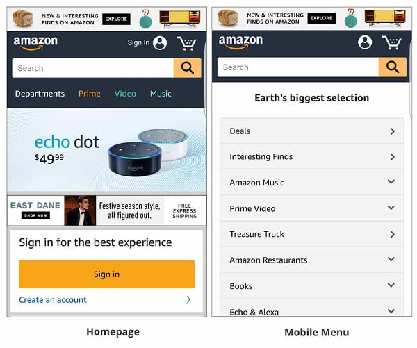
For instance, if you open Amazon, you’ll see that the website is user-friendly and functional, whether you’re using your mobile phone, tablet, laptop, or desktop.The tech-savvy team behind Amazon makes sure that the website is optimized for mobile, so they don’t miss a sale due to something like platform preference.
How Does Mobile Optimization Affect SEO?
A decade ago, mobile devices weren’t as popular, so most websites were designed specifically for desktop screens. Google and other search engines relied on desktop signals to make decisions on how to rank websites in mobile results as well.
That meant that if you ranked well for desktop searches, you’d rank well for mobile searches as well—regardless of the mobile-friendliness of your website.
But then Google shifted to a mobile index, and other search engines followed suit.
The result? Being mobile-friendly is no longer optional: it’s a necessity. Now, Google looks at your site’s mobile version to see if it deserves to rank on the first page. So if your site is not up to scratch, you’ll have difficulties climbing the search ladder.
Most mobile devices also have voice-activated tools, resulting in a boom invoice search as well. This feature helps people easily find your website on mobile—assuming that your pages are responsive and contain the right content.
Web War I: The Mobilegeddon
When Google first rolled out their mobile-first and mobile-friendly update, it quickly earned several nicknames: mobocalypse, mobilepocalypse, mopocalypse, and so on. The moniker that ultimately stuck was “Mobilegeddon”, credit for which goes to Barry Schwartz at Search Engine Land.

A Subtle Revolution
The Mobilegeddon, however, wasn’t the earthquake everyone in the industry expected, but rather, a subtle evolution. Overall, it became a headscratcher for many businesses and marketers, because there wasn’t any measurable impact. Of course, there were some who really felt the change as they got hit and had a hard time rebuilding their rankings.
However, for the most part, the update didn’t produce huge ranking changes across the board. The impact was “meh”, and everyone in the industry began to relax a few weeks after the rollout.That is, until themobile-first index update, also dubbed Mobilegeddon 2.0, came along.
The first Mobilegeddon laid the foundation for all other changes to the world of mobile SEO, which will solidify the mobile user experience.
Web War II: The Mobile-First Index
Google first introduced the mobile-first index concept in 2016, a few years after Mobilegeddon. With the update, the search engine mammoth will maintain its dependence on one index of pages and apps—but they will be turning to websites’ mobile versions first. With that, the term “mobile-first” was born, mobile-first indexing became entrenched as the current standard, and the second Mobilegeddon took place
With the mobile-first index, Smartphone Googlebot crawlingincreasedsignificantly. Snippets and cache pages will be taken from the mobile version of websites as well.
A Cultural Shift
The mobile-first index was not just an update—it was a cultural shift, as Google pushed to shake up the market. In addition, the update has become less about organic search, and more about responding to consumer behavior, which is trending in the direction of mobile.
Google is experimenting on the mobile-first index on a small scale and will likely ramp up the change once they are confident about providing a great user experience. Folks from the company said that there is no specific date and time when the mobile-first index will be fully rolled out.
Not a Mobile-Only Index
It’s called mobile-first, not a mobile-only index. If your site does not have a mobile-friendly version, Google will still include the desktop version in the index.
But then again, those with a mobile-friendly version, and who provide a bettermobile experience to users, will receive a ranking boost, even for desktop searchers.
However, Google says having no mobile website at all is better than having a bad mobile website. So if you just plan to throw together a mobile version that’s full of errors and unavailable content, don’t bother.
Google’s ‘Classifiers’
In selecting sites to switch over to mobile-first indexing, Google has established factors to determine the readiness of a website, or how comparable its desktop version is to the mobile version when it comes to links, content, multimedia, schema, and other essential elements.
If the mobile elements match 100% of the desktop elements, the search engine will switch it to mobile-first indexing. If both site versions only match 80%, Google might wait and communicate with the webmaster about the necessary changes to make.
Note, however, that mobile-first websites won’t be notified of their status. Google won’t tell you if your site has been transitioned to mobile-first indexing.
Key to a Mobilegeddon-Proof Website: Responsiveness
With the Mobilegeddon and mobile-first index update shaking the industry, Google has published a how-to on making mobile websites responsive.
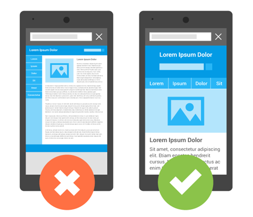
A responsive web design detects the kind of screen being used to view the website, and changes the layout of the websiteaccordingly. A desktop wide screen display, for instance, should have a design with two or three columns of content; by contrast, a smaller screen, say, on a smartphone, should have the same content presented in a single, scrollable block of text. The text and links should be easy to read even on a smaller display. This should happen with one URL and one content source.
The techiques that Google laid out are pretty basic, and while the search engine supports many changes on mobile, they recommend responsive design.
Mobile-Friendly Website vs. Responsive Website
Note, however, that a responsive website and a mobile-friendly website are two different things. The latter looks good on a small, mobile screen, but might be difficult to navigate when viewed on a larger screen. A responsive website, on the other hand, adapts to the size of any screen.
Future-Proofed Websites and Lower Maintenance Costs
Other than getting a boost in rankings and offering a better experience to users, an advantage to having a responsive website is that your site can support future devices. As new devices hit the market with unique, innovative screen sizes (or shapes), your website will already be prepared to adapt to these.
Having a responsive website also means you don’t have to run two versions of a website, which in turn leads to lower maintenance costs.
Common Mobile SEO Mistakes
The number one mistake of businesses and marketers who conduct mobile SEO campaigns is that they ignore this one important element: content.
Remember that users check the weather, keep up with sports, and read the newspaper on their smartphones and tablets. They’re interacting with a lot of content, and while much of thisis consists of images and videos, they also interact with a lot of the written word. Poorly written content will reduce your content’s shareablility, reducing its value in Google’s eyes and limiting your site’s growth potential.
Here are other common mobile SEO mistakes:
1. Blocking Javascript, CSS, and image files.
Your developer may block the elements mentioned above on the website. But did you know that doing this is actually against Google’s guidelines? Blocking any images or scripts from the mobile site will make Google flag your website with a low grade.They said so themselves:
“Blocked JavaScript, CSS, and Image Files…directly harms how well our algorithms render and index your content. This can result in suboptimal rankings.”
Make sure, therefore, that all your files are visible to the search engine’s crawlers.
2. Having slow site speed.
Having a website that loads instantly is necessary—and it’s even more important when you’re optimizing for mobile.
More than half of users will exit a page if it takes more than three seconds to load. This is especially true for mobile users. On a desktop, you can deal with data-heavy pages, but on your mobile phone, it’s a different story. Mobile users would rather leave your website and go to a competitor’s that functions optimally.
A slow website also affects your mobile ad revenue. According to Think With Google:
“Slow loading sites frustrate users and negatively impact publishers. While there are several factors that impact revenue, our model projects that publishers whose mobile sites load in 5 seconds earn up to 2x more mobile ad revenue than those whose sites load in 19 seconds.”
Fortunately, Google’s PageSpeed tools can give you a helpful gauge to determine your site’s mobile speed performance.
3. Ignoring broken redirects.
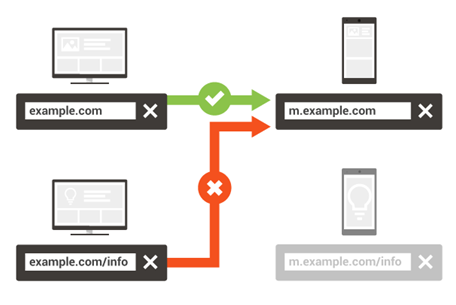
This one’s a real killer. When a mobile user accesses your desktop version, the redirect should go to the mobile version; when a desktop user accesses your mobile version, the redirect should go to the desktop version.
Links should redirect to the appropriate pages all the time.
This is what Google said about the issue of redirects:
“The most important thing is to serve correct and consistent redirects (i.e. redirect to the equivalent content on the desktop or mobile site). If your configuration is wrong, some users may not be able to see your content at all.”
4. Not paying attention to unplayable content.
Sometimes, the videos on your desktop website will not run on a mobile device properly, which means a bad user experience. We suggest using HTML5 whenever you embed to improve your site’s usability on all devices. Avoid Flash as well, so search engines will easily understand your content.
5. Using interstitial ads improperly.
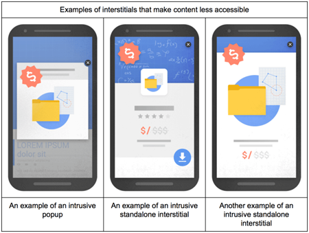
Have you ever gotten so irritatedby a huge pop-up ad that you just closed the website? This is how your website visitors feel, when while browsing your site, an interstitial suddenly appears to cover their entire screen.
Interstitial ads or ads that cover the whole website or app are great for generating demo sign-ups, building email lists, and driving other conversion actions. But these are only great for your desktop site—it’s different for mobile.
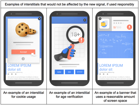
Not only will you lose potential sales, but Google will also penalize you for having overly intrusive ads. At the start of 2017, tThe search engine rolled out a search signal which affects the ranking of mobile websites that improperly use interstitials.
This does not meanthat you should avoid them entirely. Sometimes interstitials are useful for certain calls-to-action, or for confirming the user’s age. But to avoid being dropped like a hot potato, make sure interstitials only cover a small area of the display.
6. Having mobile-only 404 pages.
Some sites show content to desktop users, but return a 404 for mobile users accessing the same landing page.This often happens when developers create a mobile-only version of their website, and forget to make sure a link to a page is available on the mobile site.
This will turn away potential business and even have a negative impact on your ankings, so eliminate all 404 and soft 404 pages as quickly as possible. Make surethat the mobile version of your page is properly configured to avoid showing an error message. Use a broken link checker, which will let you know when a link is going nowhere.
7. Optimizing according to the wrong platform.
Optimize for mobile keyword research, not for traditional search terms. Note that mobile use make typos easier, try to type shorter queries, and speak their queries rather than type them. Mobile users also look for different things compared to desktop users, such as the nearest Italian restaurant.Therefore, keyword research for desktop and mobile should be different.
How Can a Website Get a Lightning-Fast Page Load?
Not only is lightning-fast page load necessary to get higher rankings, but it also boosts visitor engagement and retention. In addition, according to a recent study, each 1-second page load delay decreases page views by 11% and customer satisfaction by 16%.
But how can you make your page load speed as fast as lightning?
1. Prioritize loading above-the-fold content.
The first thing your site should load is the content a user sees first, or the above-the-fold content. Google calls out websites whose pages do not load content above the fold first, recommending that website owners should prioritize visible content.
Build your web pagesin such a way that your server sends the data required to load above-the-fold content before anything else.
2. Reduce the server response time.
The server response time is how long it takes a server to return the initial HTML. Obviously, the longer your server returns a request, the slower your page loads.
Keep this time within 200 milliseconds—or less, if you can.Reduce response times by optimizing your Time to First Byte (TTFB). TTFB measures the time fromthe moment the user first requests an HTTP to the moment the browser receives the first byte of the page.
3. Optimize and compress the images.
Generally, large files take longer to download compared to smaller files. The load time of a page depends on the total size of downloadable content assets, which means high quality, bulky images are large contributors to web page size and therefore to a slower page load time.
Compressing the images on your mobile website can also increase your load speed. Compress your JPGs, PNGs, and GIFs by at least 30% to 40%, but make sure that the image has the detail it needs for the space provided.
Use an image editing tool—don’t let the browser minimize the image. Don’t use images that are too large for the display. For instance, don’t use a 1,500 by 1,500 pixel image if mobile visitors will only see it at 500 by 500 pixels.
4. Minify CSS and JavaScript files.
If your page loads slowly, chances are that’s because of lots of unnecessary, heavyCSS or JS files being loaded inefficiently. Remove those through a minification process.
To minify means to remove unnecessary data without affecting how the browser processes the resource. Some examples include removing unused code and using shorter variable and function names.
Note that one of the disadvantages of using a content management system—say, WordPress—is that a new CSS or JS file is added every time you install a new plugin.
The first step to minifying your resources is to remove unnecessary code, then remove any extra scripts. Take out all the extra spaces and line breaks as well. You can do this manually, but if you want to minify faster, use an automated tool.
5. Minimize landing page redirects.
Redirects automatically take your visitors to other pages, and while they’re useful, redirects create additional HTTP requests and eat up valuable time, which means they contribute to a slower page load. This is especially challenging on tablets and smartphones, as these devices often depend on less reliable networks compared to desktop computers.
Permanent redirects, also called 301s, are preferable to 404s, sure, but they still slow down your page load speed.
Use a redirect mapper and remove crawl errors found in the Google Webmaster Tool.
What are AMPs and Why Should You Care?
In 2016, Google and Twitter started working on the Accelerated Mobile Pages (AMP) Project. It’s an initiative that reduces the time content takes to load on a mobile device, improving the mobile web experience.
At its core, AMP is a stripped down version of HTML, built to be super lightweight to reduce loading times.AMP helps create pages for static content, which don’t change according to the behavior of users, allowingthese pages to load faster than regular HTML.
With AMP, site elements like images don’t load until they’re scrolled into view. The whole platform is designed for pure speed and pure readability.
To date, all websites that have AMP pages will have a boost in exposure across all of Google.
Mobile Search Engine Optimization Tips
1. Increase your page load speed.
Every second counts in mobile SEO. To increase the load speed of your pages, analyze every image and every piece of CSS and JavaScript, and compress whenever and wherevernecessary. Compress or resize large images whenever possible as well. On mobile, every byte counts when it comes to speed.
2. Design for big fingers.
Your mobile website should have a design that users can easily scroll with their fingers. Fingers come in all shapes and sizes, so design with big fingers in mind.
Make sure your buttons, links, or any other touch target is large enough so that even a big finger can press it. Targets should also be far enough apart so users won’t accidentally press the wrong button. The average index finger for most adults is 15 to 20 mm, which translates to 45 to 57 pixels. Therefore, give tap elements 57 pixels of space for selection areas.
In addition, make sure your website is completely navigable even with one thumb, and requires no pinching. If users have to pinch to zoom in or out, your content is probably too small or not optimized for that browsing device.
3. Add a click-to-call button and optimize contact forms.
Make it easy for mobile users to call you directly from the mobile version of your website. Display your phone number prominently, and embed an easy click-to-call access buttonon every page.
Make sure your contact forms use HTML5 input types as well, which automatically register the correct keyboard for mobile users. Request the minimum amount of information you need to contact a lead, and minimize the number of form fields. If you can, use the technology built into mobile devices. For instance, don’t ask a user to enter their city, region, and ZIP; if you can,use GPS to populate it instead.
4. Implement AMP.
Implement AMP if you’re a publisher. E-commerce businesses, or those that use their website for lead generation, may also benefit from implementing AMP.The benefits of deploying AMP design were mentioned above.
5. Think like a mobile user for keyword research.
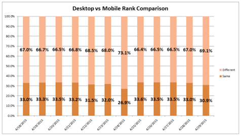
Approximately 69.1% of keywords rank differently on mobile. Therefore, do separate keyword research.
What does your target market want to accomplish with mobile search? How can you meet those needs?Ask yourself these questions when doing mobile keyword research. This will allow you to come up with the right keywords that are relevant to mobile user needs and behavior, and craft content that entices and engages them. Use the keyword research tools you’ve been using for desktop, but be smart about it. Know which keywords would most likely be relevant to mobile queries.
Keep voice-based searches in mind, too. Many mobile users use voice search; asking Google, Siri, or Alexa to find a local business is very convenient, after all. Use voice search-friendly keywords so your mobile website content can keep up.
6. Do some local SEO.
More and more mobile users are localizing their searches, as having a mobile phone or tablet makes spontaneity more possible. After all, you can ask your phone where the nearest artisanal ice cream store is whenever you feel like it.
Google, in fact, found out that 76% of individuals who turn to the Internet for something they need visit a nearby related business within a day, with 28% if those visits leading to a sale.
This is exactly why it’s important to work on your local SEO. Mention your location a few times throughout your website. Register your business with Google as well, and add your address, business hours, and contact information. The next time someone wants to buy artisanal ice cream, you want them walking through your door.
The Golden Rule: Do What the Search Engines Say
All of these will take work, and mobile SEO isn’t really that popular yet in the Philippines. But the good news? When you do mobile SEO, you’re giving your business a chance to develop an advantage over your competition.
When you get right down to it, mobile SEO isn’t really that different from traditional SEO. Just do what the search engine giants like Google tell you to do: design a mobile-friendly, responsive website, and welcome the rising ranks of mobile users.
Because with the rise of mobile-first indexing and more than 50% of searches coming from mobile devices across the world, mobile SEO is no longer something you can ignore.

 (
( (
( (
( (
(